
Customization Tool
When I first joined Minted, the first project was to re-design the customization tool Minted uses to personalize their holiday cards, wedding invitations, save the dates, stationary, and gifts.
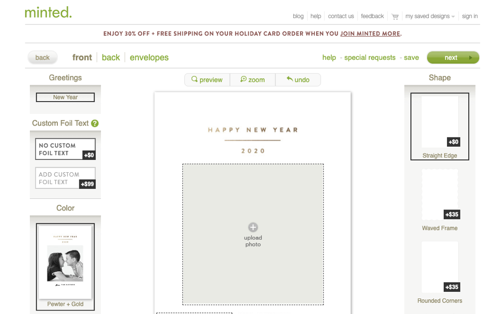
Old Front
• Not everything a user needed to complete their designed envelope was on the page at once
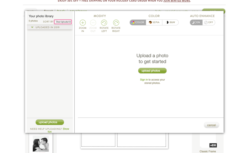
• Uploading a photo prompted a modal which covered the card which led to a user not seeing what it looked like once they added it
Key Findings during testing
• Navigation was confusing
• Green arrow was not a strong enough visual indication for ‘NEXT’
• Re-organization of key elements is great and help anchors the user on the right
• Foil switch was very confusing to users. They did not know what to do with that.
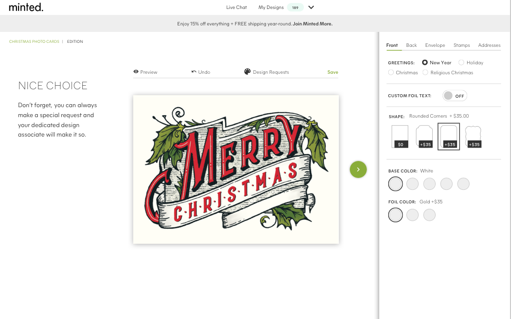
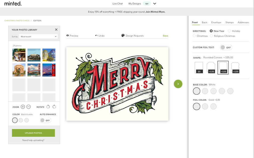
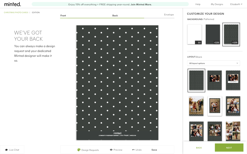
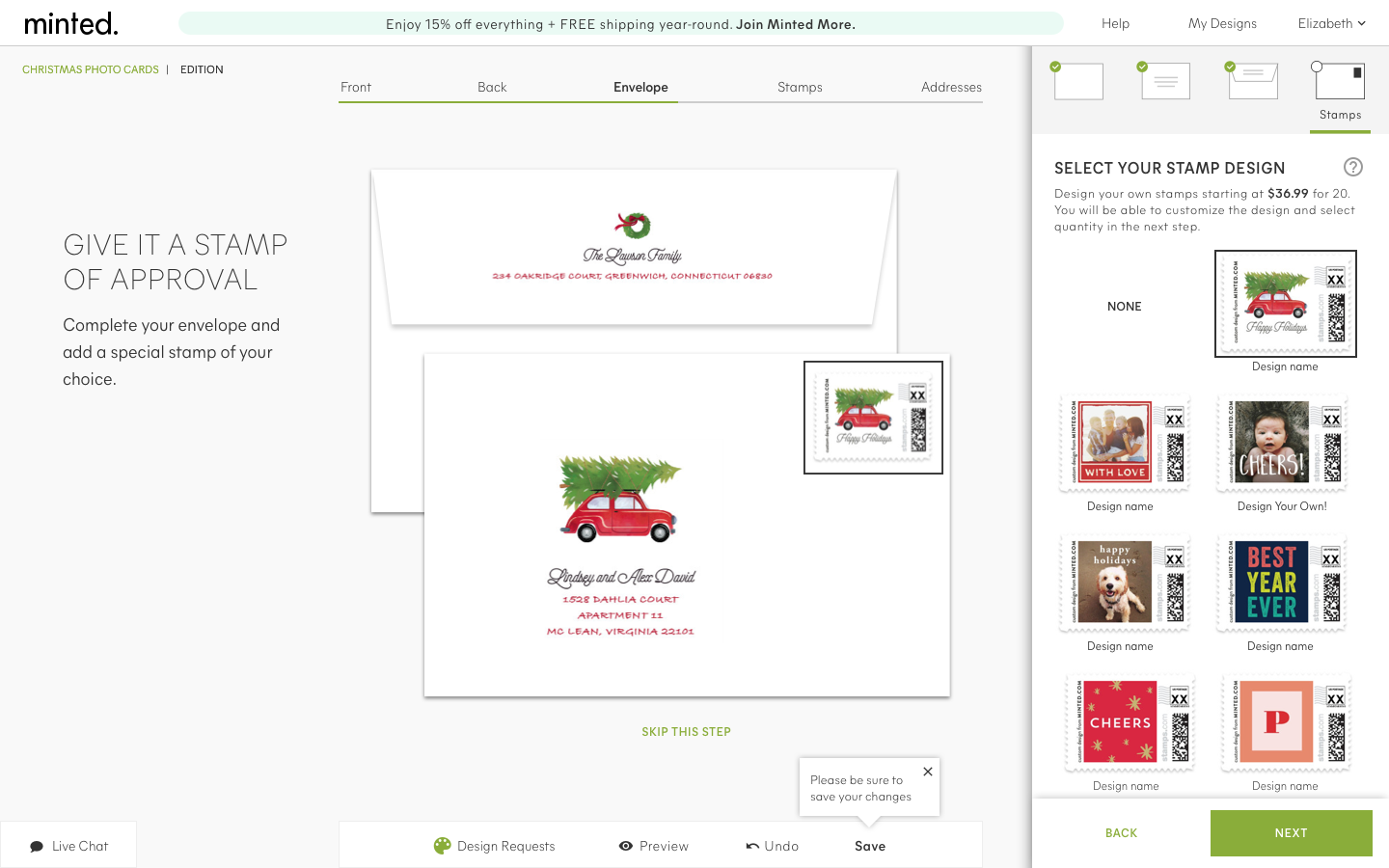
Final design
•Changed the navigation: moved the steps (front, back, etc) to above the card for direct correlation to the process. The design requests, preview, undo and save moved to below the card
• Changed the order of elements on the right, color, shape
• Swapped out the foiling switch for a button
• More space was created by moving the promo into the nav bar alongside help, my designs, and login
• A title on the right was added to anchor and provide context to the user
• Replaced the green arrow with next/back buttons/text

Old backer

Key improvements
• Added a filter to make it easy for the user to find the 9-photo backer (one of the most popular!)
• Organized the elements to fit all on one screen; making it a consistent experience throughout
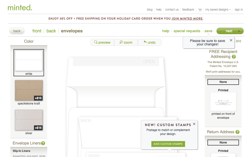
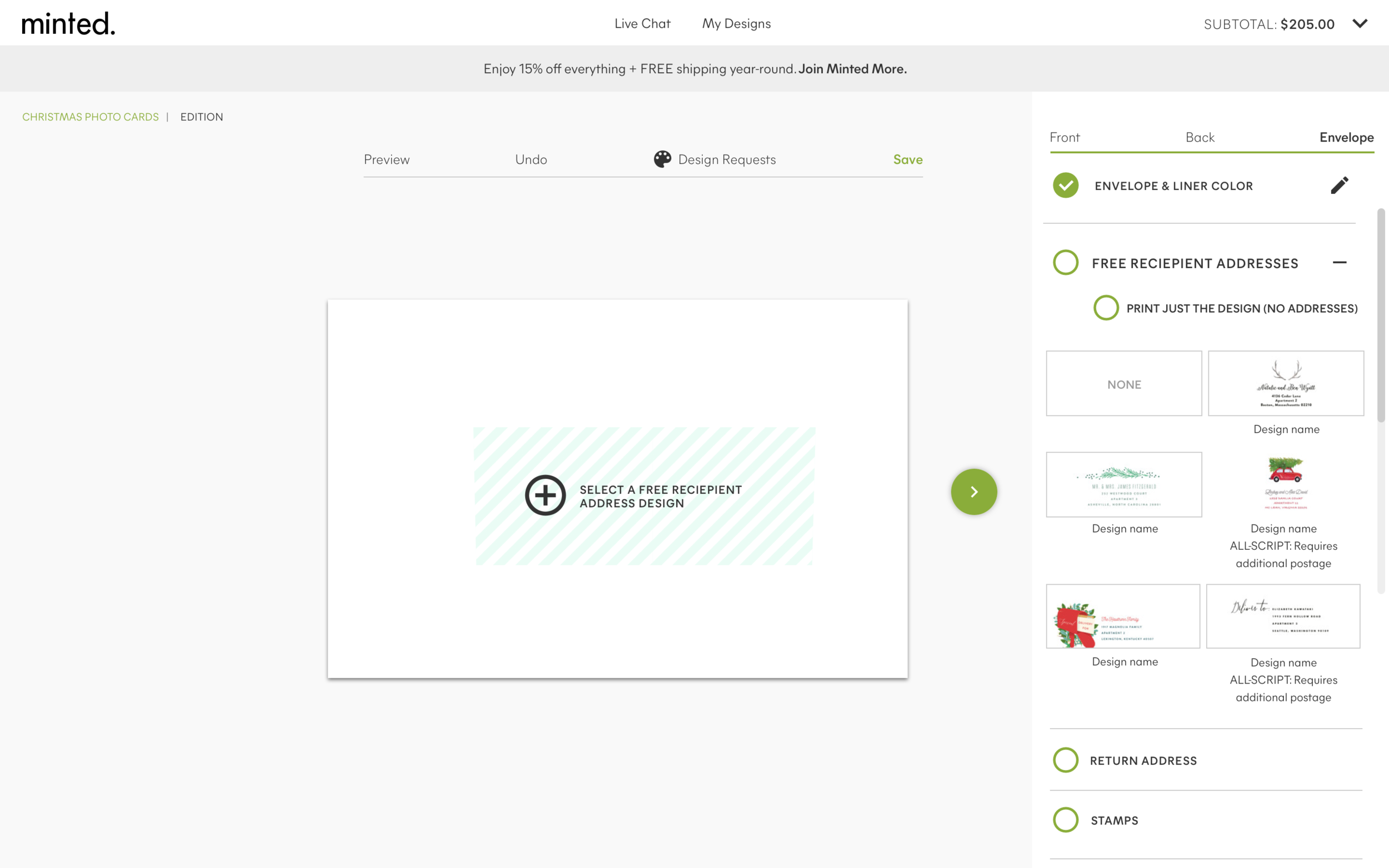
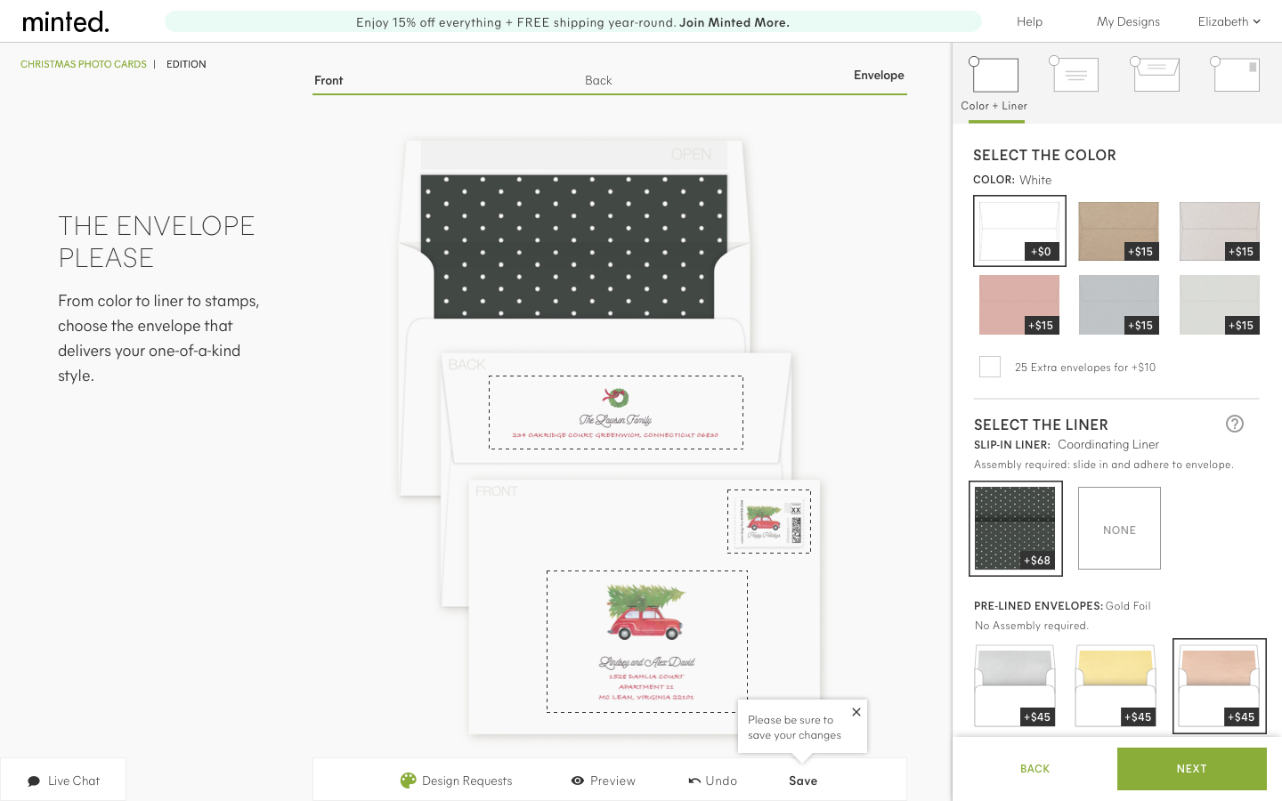
Old envelope design section
• Not everything a user needed to complete their designed envelope was on the page at once
• Too many tool tips and dual working panels led to confusion of what to complete in what order


Key findings during testing
This proved to be one of the most complicated sections of the experience (in addition to the navigation)
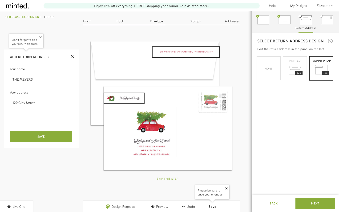
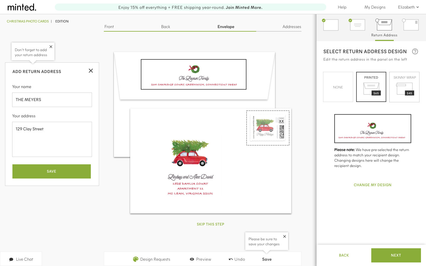
• Keeping the information organized on the right hand side acted as an anchor
• The blue lines were more of a distraction than a helping factor
• The text editing panel moved to the left to reduce the overlap on the design itself
• The green circles were thought of as check list
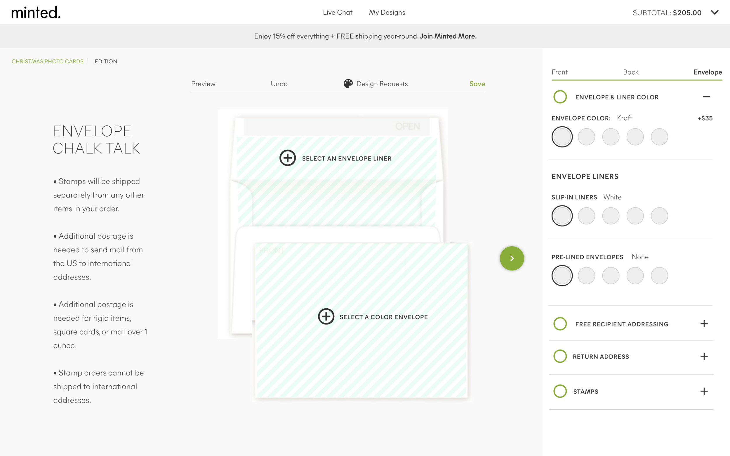
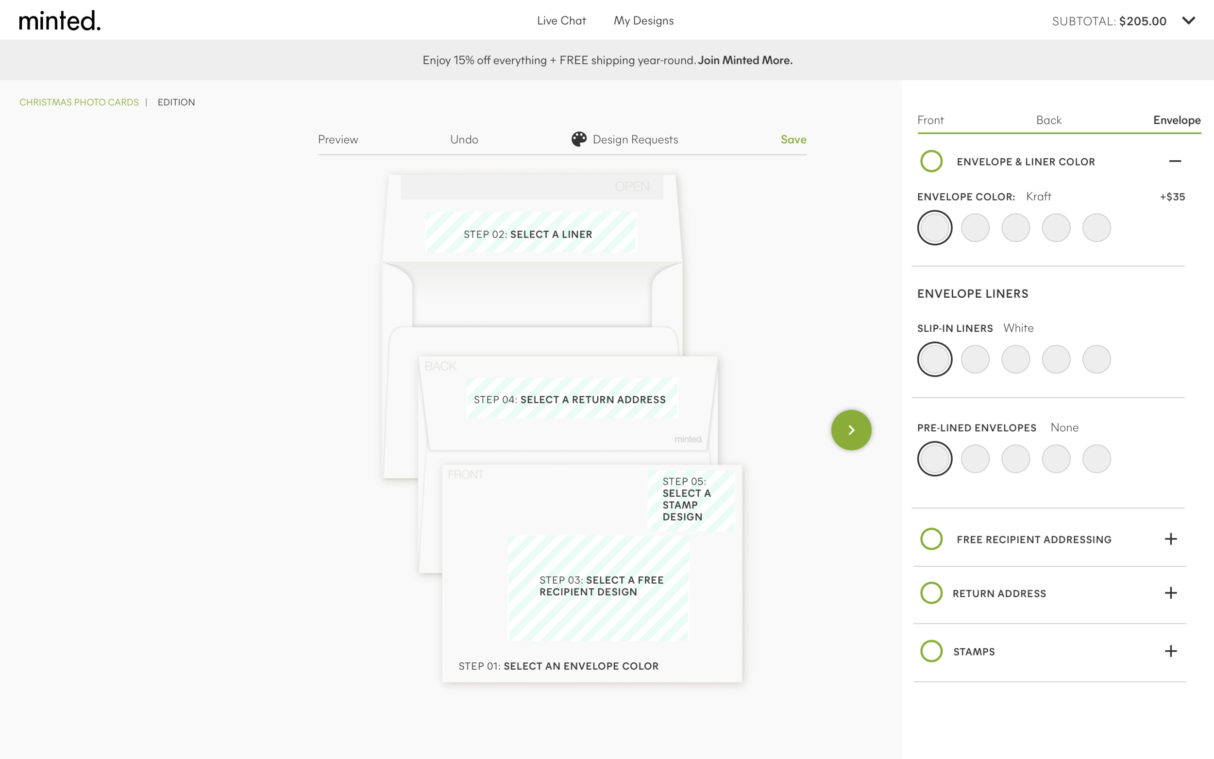
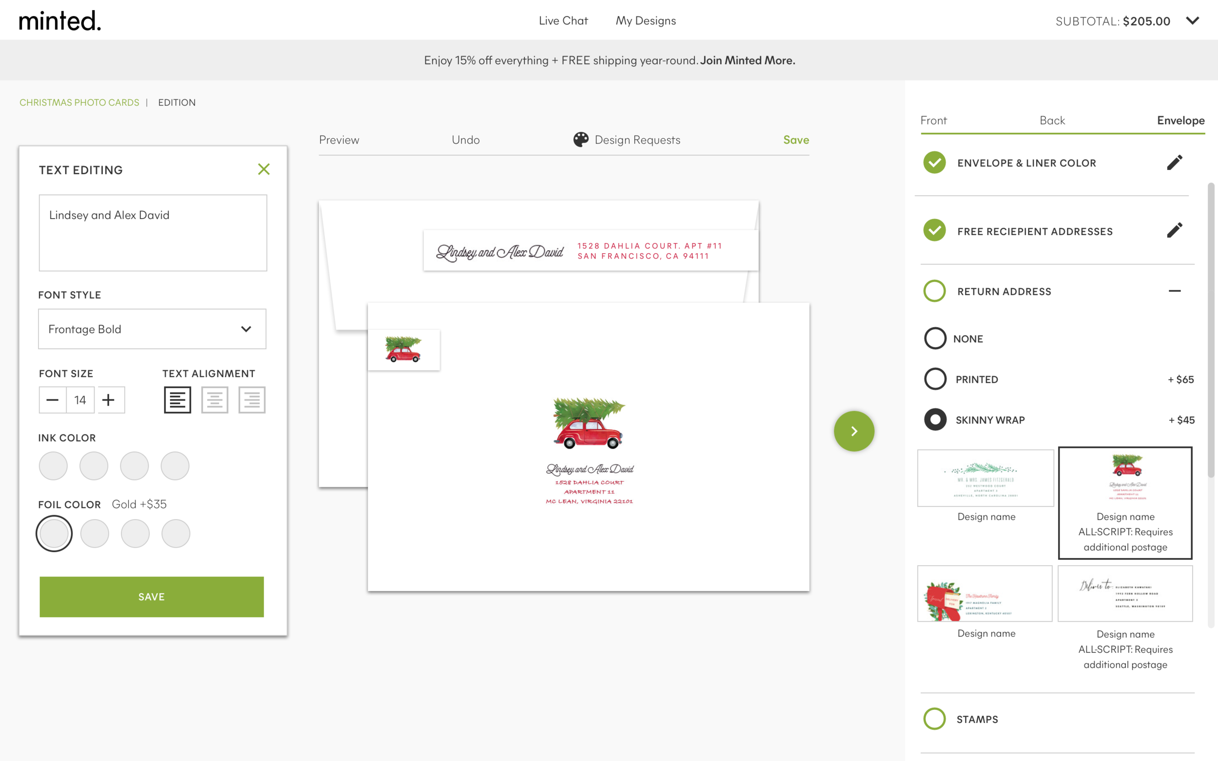
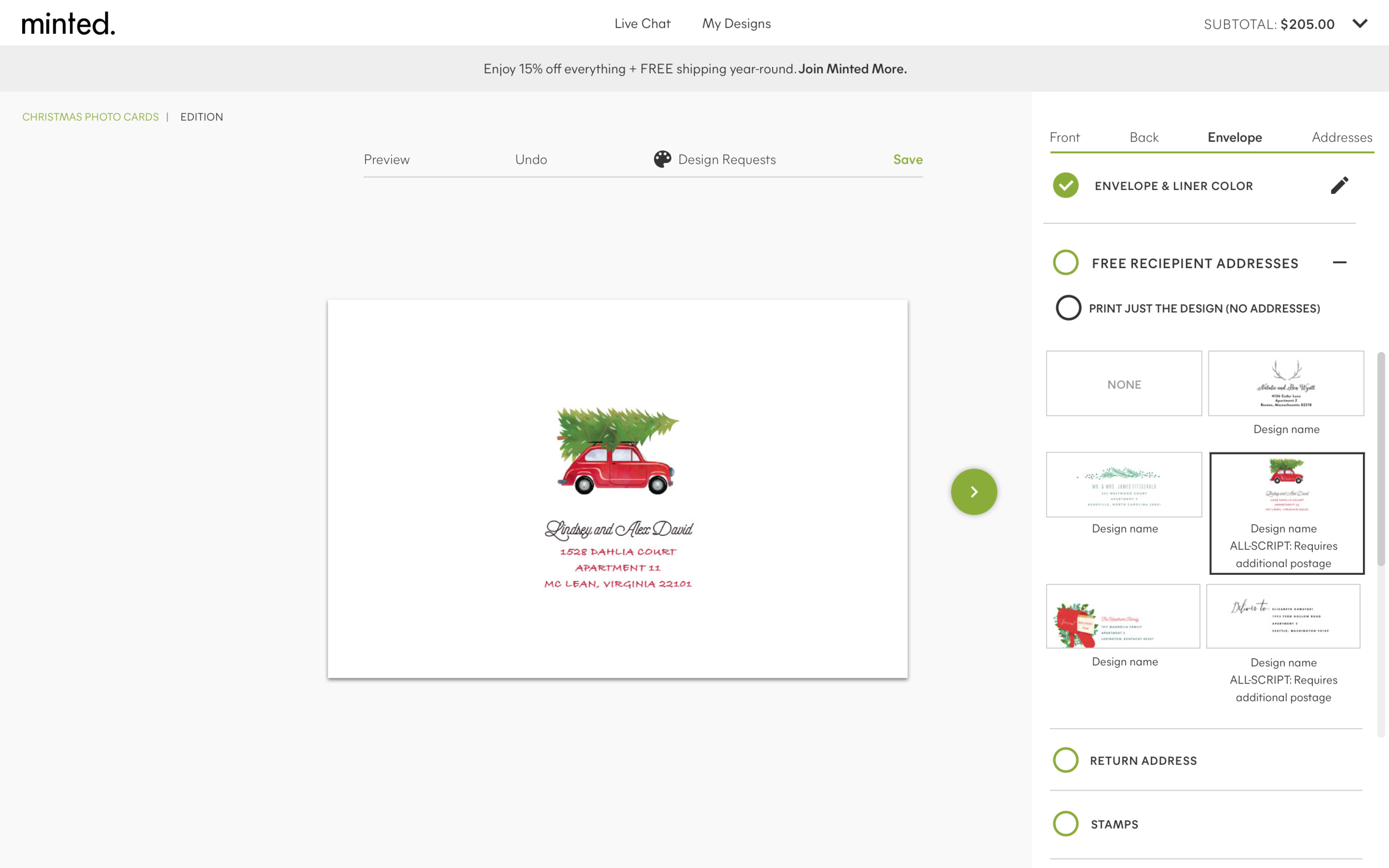
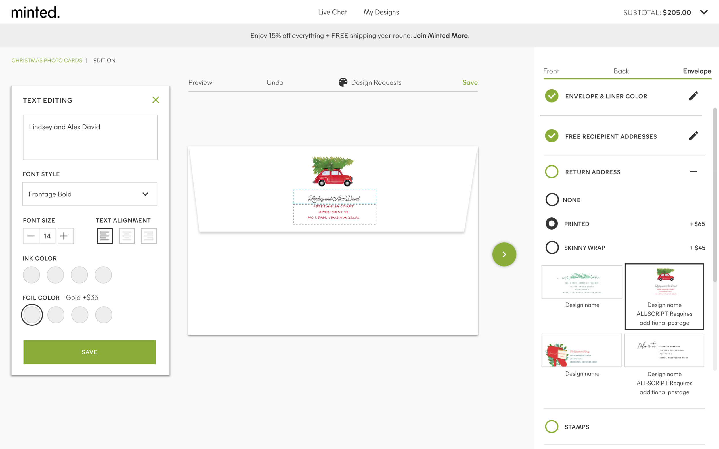
Final design
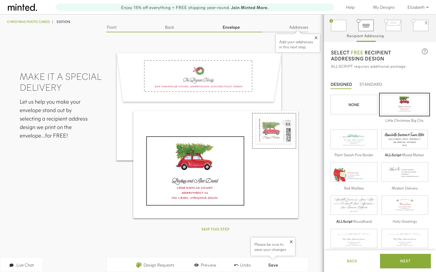
• A second navigation of small icons and labels (upon selection) were introduced to guide the user thru the process
• Removed the blue diagonal lines
• Included tool tips where needed (especially after a user adds RCP, they automatically thought they could add addresses right then and there, not realizing it was in the step after designing their envelope)
• Opted to show 1 matching design for the RAP to avoid confusion if the user was to select a design that didn’t match
• Made picking an envelope and liner much more streamlined
Final experience
Some of the quotes from our users
“Really straightforward and easy to understand. It is intuitive and easy to move through.”
“It looks pretty clean. Not too complicated. Not crazy, crazy where I don’t know how to use it.”
“Anyone could use this because it is so easy.”
THE TEAM
3 -UX | UI Designers
1-Project Manager
12-Engineers
12-Stakeholders
10-User Testers
Gift Customizations
Added a simple experience to customize gifts for someone else or yourself.